If You Lead a Customer to Booze Carriage, He Will Definitely Drink
 Ripener
Strategy, Creative, Engineering
Ripener
Strategy, Creative, Engineering
For our redesign of the Booze Carriage website, we started with three major goals. The site had to be functional, informative, and fun! The client relayed they wanted a modern design and we tried to carry over the functional aspects of the old site with an updated look and more usability. As a result, the shopping process is easy to navigate and looks better than ever.
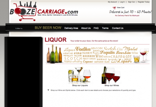
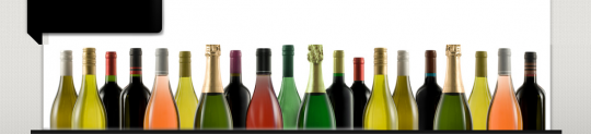
Before :
After:
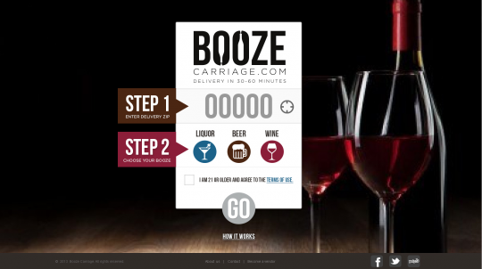
The site’s initial splash page is designed to direct the user to the right products for the correct delivery area. Fields for Zip code, booze type and the buyer’s age make it easier for Booze Carriage to deliver close and relevant inventory to its customers.
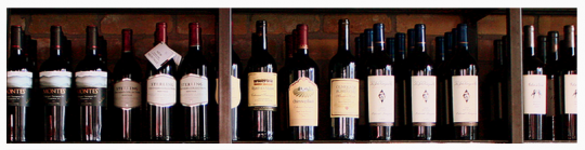
The internal page designs are based on the new logo and the adapted style guide while keeping some aspects of the client’s original site. The style guide has a darker, cripser feel, utilizing dark reds, browns and blacks. Keeping that in mind, some changes were pretty obvious like these wine bottles below:
Before:
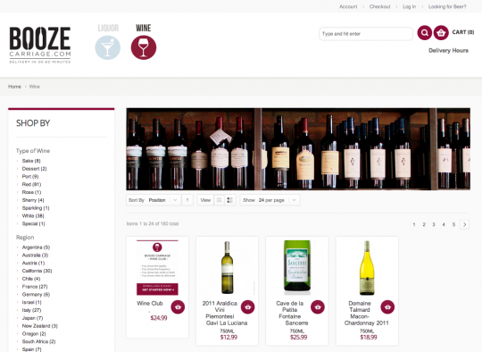
After:
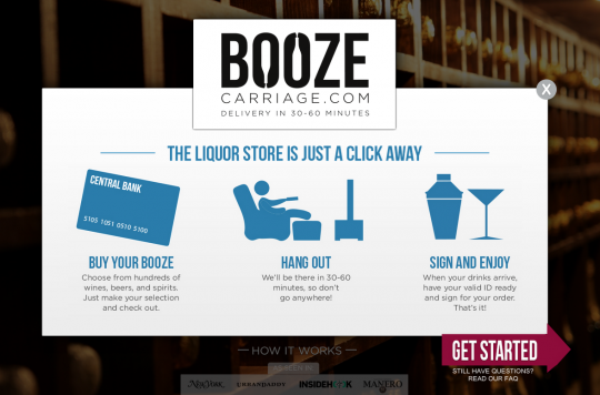
To avoid confusion with any rules/restrictions, we used a clean layout with a clear, user-friendly design. It had to be intuitive enough that people understood the different sections of the store and how they worked. Our “How It Works” guide breaks down the process into three easy steps, explaining the process further.
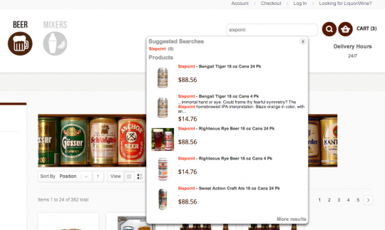
Once you’re in each category (wine, beer, liquor) you can search and browse using modified templates. We included a side bar to allow browsing by categories of alcohol by type, region and price. A customer can browse $20-$30 red wines from France or use the search bar to find the Benton Lane Pinot Noir he or she always drinks.
We also added search auto complete for relevant products without leaving the page. Can’t remember the exact name of the Sixpoint craft beer you tried last week? We have a few suggestions.
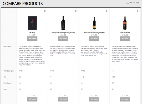
The browsing experience is further encouraged with comparison capabilities. Just click “Add to Compare” and a find a couple products (compare up to 15!). A pop out window shows you the differences and lets you add the product to your cart from the window. This is especially useful to distinguish the subtle nuances between wines. Still not sure? Print out the chart if you want.
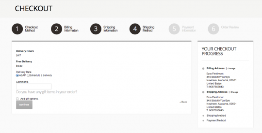
Another usability feature we added was a single page checkout system that doesn’t reload as you navigate through it. Users can go back and forth between steps in the checkout process without losing their information and having to fill it in again. A side bar holds information for continual review.
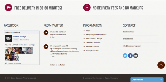
Having trouble or having fun? Tell us about it. The bottom of the page has room for contacting the company or connecting with social media to share your thoughts. Social bars, plug-ins and feeds all encourage connection and interaction between users and the client. It also doesn’t hurt that two important pieces of delivery information come standard on every page.
After many different mockups and revisions, the client was satisfied with our final site. With a careful balance of copy and design and an emphasis on a usable interface, our team created a site that captures the excitement of getting ready for a party and delivers the ease the service promises. The liquor store is just a click away.
Ripen Services:
Does your site need a lift? From redesign to new site creation, our custom web development services can provide you with the headquarters for your ecommerce business’s traffic and transactions.
Let’s get started.
Find out how we can help your ecommerce strategy.
Get in touch
If you’re a rockstar with big ideas, join our team.