UX/UI Case Study: Happy Chef
Optimized checkout for increased conversions
Overview
7 out of 10 carts are abandoned upon arriving at checkout. Primary reasons are 1) the checkout form being too complicated, 2) total costs not displayed, 3) having to create an account and 4) lack of trust in the store when providing credit card information. While every checkout can be optimized differently based on product and industry, we thought there was plenty to work with here–from industry-standard UX/UI improvements to form design standards, we identified areas for UX design solutions to lead to impactful improvements.
Before
After
Researching the problem
Analytic analysis
General usability evaluation
We started our research process by evaluating the checkout experience against UI/UX design standards.
Identifying problematic & under performing metrics
- Determine time spent on page to successfully place an order
- Determine conversion rates
- Find the number of repeat errors a used experienced
- Determine prevented orders (unable to recover, abandoned at checkout)
Established benchmarks
We documented current metrics, to measure and validate the impact of our proposed solutions and design improvements.
Targeted user session videos - testing hypothesis
We started our research process by evaluating the checkout experience against UI/UX design standards.
Customer pain points
1: Need for general usability & interface improvements
The overall design was dated, cumbersome, and overly complicated for users, resulting in higher average time spent on page and a high rate of abandonment.
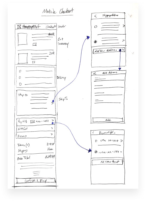
2: Not mobile friendly
Mobile performance was below industry averages, due to a mobile design that was hard to digest and left users feeling lost. See example below.
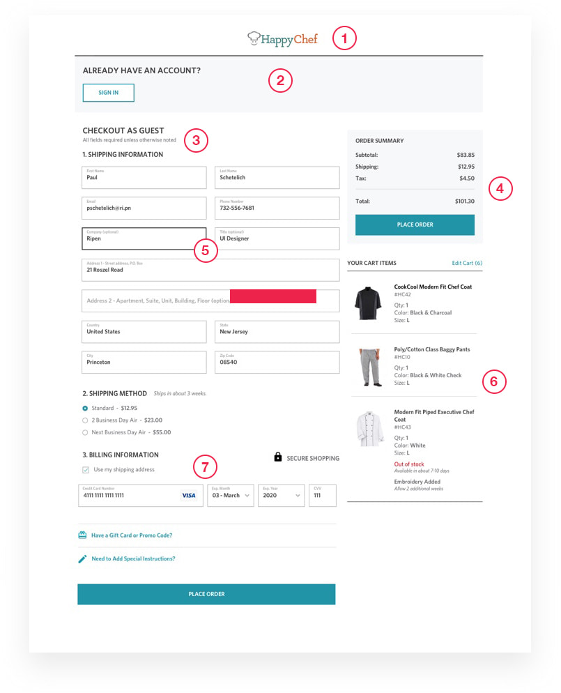
Usability issues:
- 1
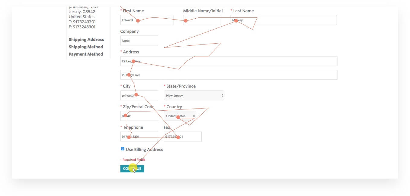
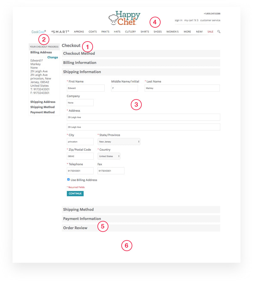
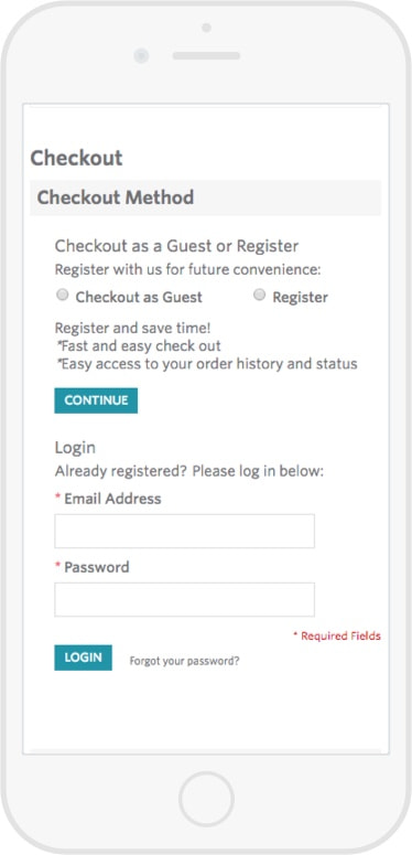
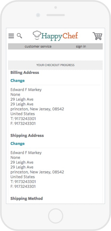
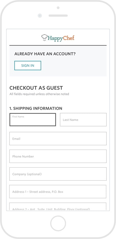
Aesthetic is outdated visually and accordion style checkout is fragmented and hides information, especially on mobile.
- 2
Users had to determine if they had an account and sign in, checkout as a guest, or create a new account before seeing other order information.
- 3
Lack of form styling to indicate current location and entered information.
- 4
Top navigation allows and enables users to easily exit from the checkout process.
- 5
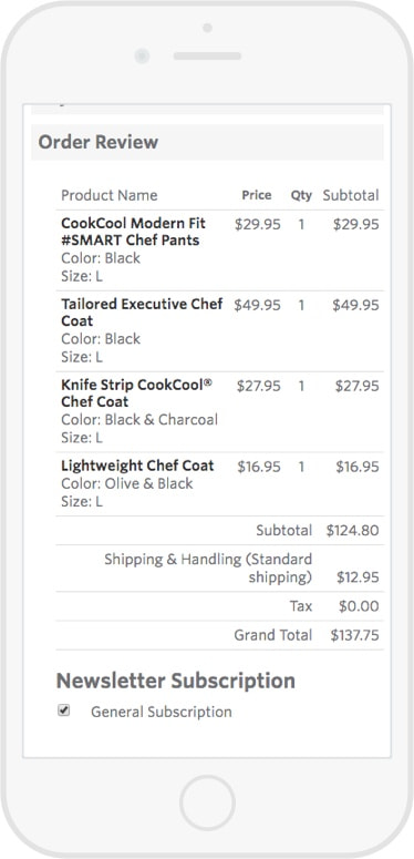
Clickable products in “Order Review” also allow users to exit checkout process at the final and most crucial stage.
- 6
Order summary is not always visible.
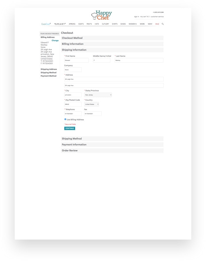
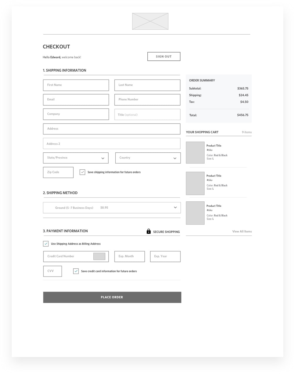
Before: Guest Checkout
Before: Addresses
Before: Order Summary
Hypothesis
By replacing the accordion style design with a simplified one-screen style, minimizing “Create account” actions, implementing input constraints and inline validation, and presenting clearer totals will decrease the time spent on page, reduce repeat errors, and decrease the rate of prevented orders.
Designing Solutions
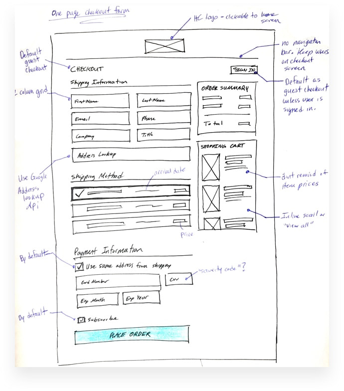
Brainstorm sketches
Simple sketches allowed us to explore concepts to structure a new and improved checkout for both desktop and mobile experiences.
Wireframes
With these low-fidelity mockups, we took a detailed look into scenarios, layout, content, and could start testing ideas with clickable prototypes.
Mockups
Reviewing the page in a more final visual form allowed us to preview the enhanced experience and optimize the size and spacing of content, form fields, and overall layout.
Solutions
-
1
No Top Navigation
Simplify top navigation to minimize leaving the checkout, but still allow user to click through to homepage.
-
2
Single Page Layout
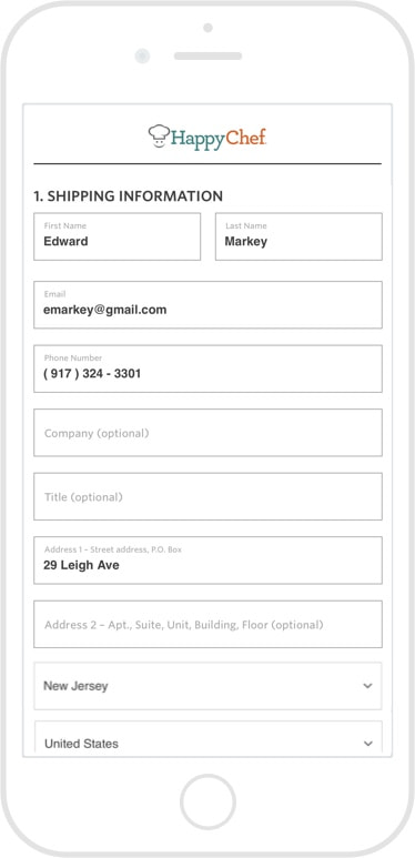
A double column form layout with an updated, simplified style consistent with the rest of the site.
-
3
Default to Guest Checkout
Emphasize guest checkout and sign-in button at top of form, and provide link on “thank you page” to create a new account. Complete the order, worry about creating new accounts later.
-
4
Order Summary
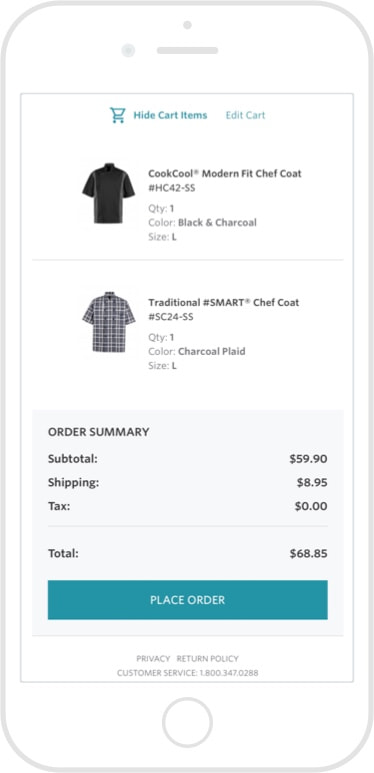
A fixed order summary, visible at all times.
-
5
Active Field Focus
Thicker, darker border on active fields and darker, bolder font style for entered information.
-
6
Credit Card Fields Layout
Credit card type is detected once digits are entered, secure shopping symbol to create confidence.
-
7
Non-Clickable Cart Items
Remove the ability to navigate to a product’s detail page within the mini cart summary.
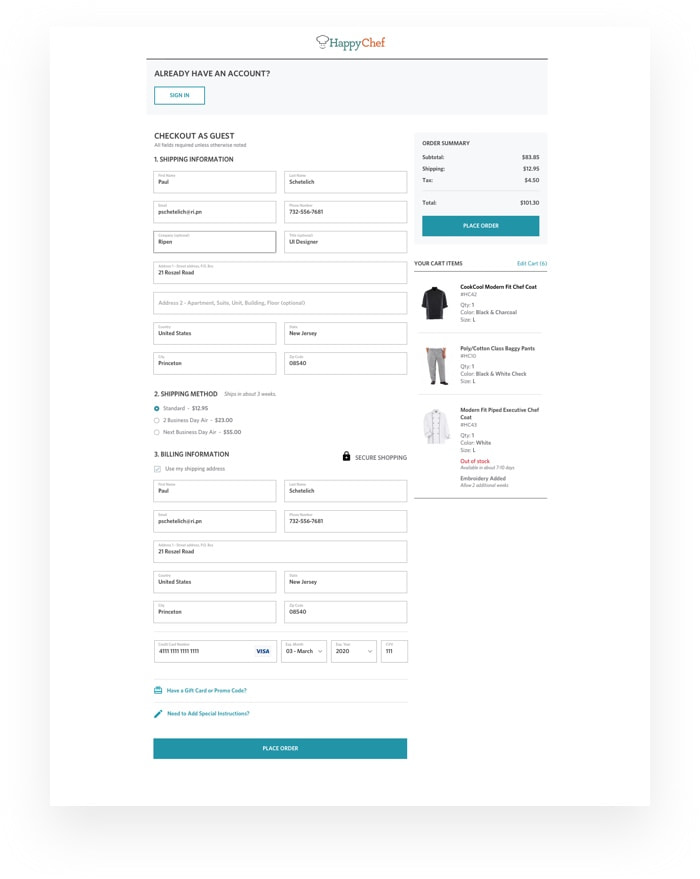
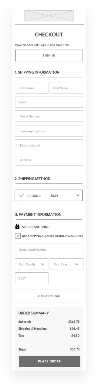
After: Guest Checkout
After: Addresses
After: Order Summary
Impact Summary
24%
Increase in checkout page conversion rates
12% Desktop | 40% Mobile
51%
* Increase in success rate after checkout error
60% Desktop | 42% Mobile
18%
Decrease in time to complete checkout
19% Desktop | 16% Mobile