UX/UI Case Study: Happy Chef
Online embroidery
Our mobile-first design approach leads to the most intuitive embroidery application process in the chef apparel industry.
Researching the problem
Personalized chef apparel is a big deal in the food industry. Whether you're an individual chef looking to let others know who you are or you're the owner/manager of a restaurant branding your team's outfit, embroidery options should be plenty and easy to order.
Our client's customers had to learn about the embroidery through an annual catalog or a static page on their website. Once they chose the embroidery, they had to call customer service, wait for a price estimate, and then place their order.
Sounds clunky, right? Clearly there was an opportunity to streamline the process.
Original embroidery process

Pain points
Outdated and over-complicated, for both the client and the customer
The old approach lacked mobile device support, made it slower to introduce new options and relied heavily on a customer service representative's time.
Uninformative and inefficient
The back-and-forth between customer and customer service representative to communicate pricing details like setup fees regularly led to frustrated customers and cancelled orders.
Design objectives
Business focused
- Reduce dependency on customer service representatives
- Make updating embroidery options more efficient
User focused
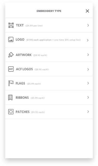
- Design a more informative process. ie: pricing, colors, styles, etc.
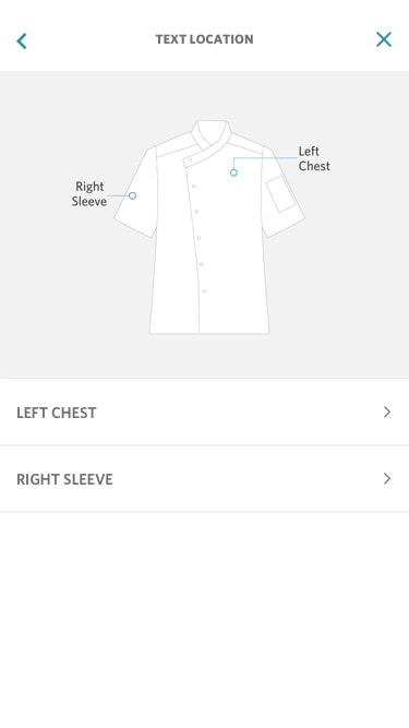
- Create an intuitive way to indicate available embroidery locations per product
Proposed user flow

Designing solutions
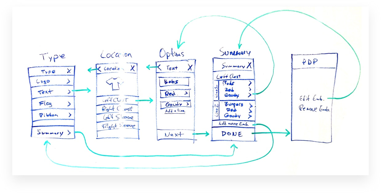
Sketching
We explored concepts via sketches to structure a new and improved embroidery experience. This allowed up to map the possible user flows and cover the majority of scenarios.
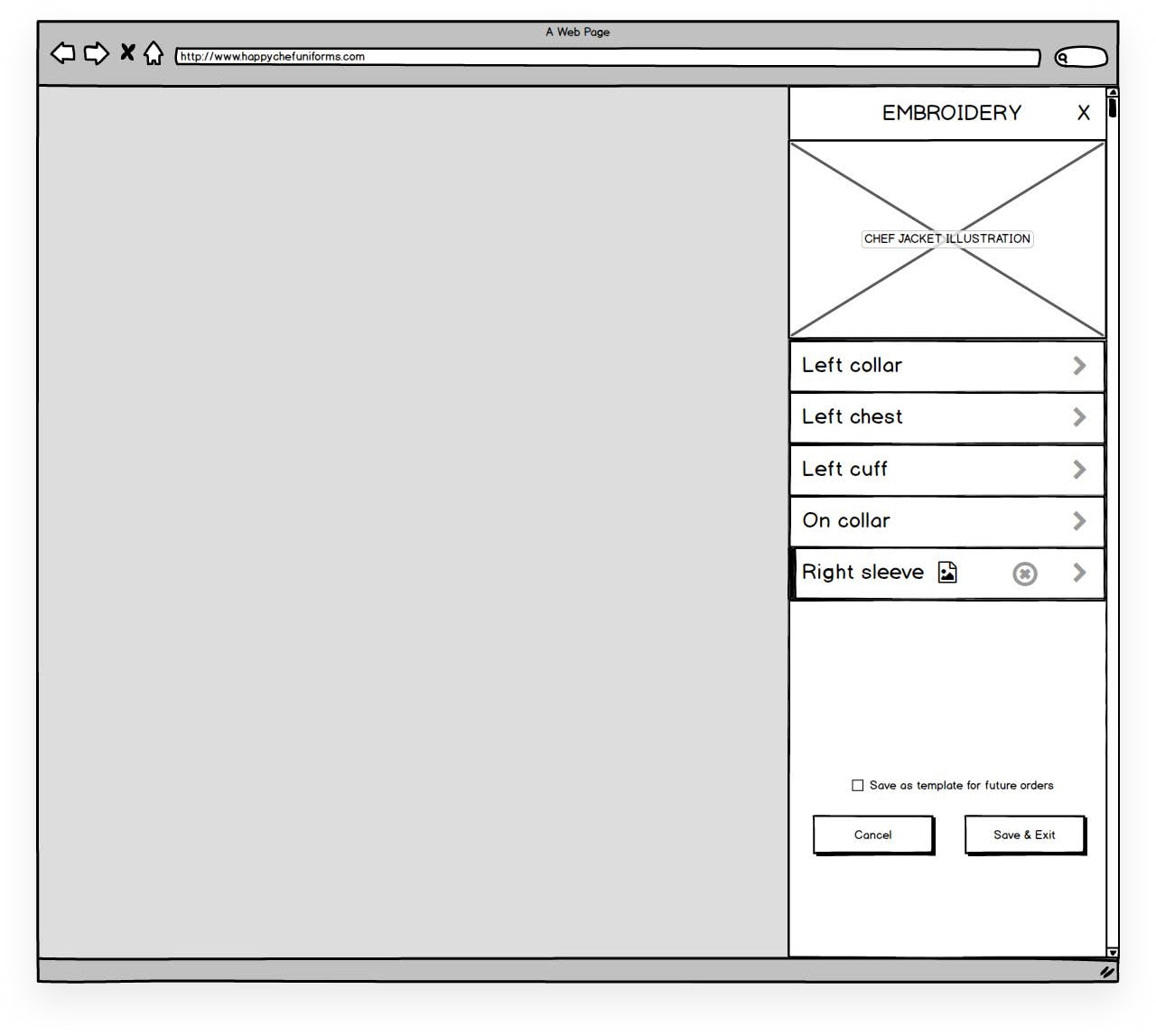
Low-fidelity prototypes
These initial wireframes allowed for testing both an accordion style concept as well as a left-to-right concept.
High-fidelity prototypes
Insights from further testing revealed the left-to-right concept was preferred by users, who found the embroidery process more seamless by tackling one decision at a time and felt like a more natural experience.
Left-To-Right Approach
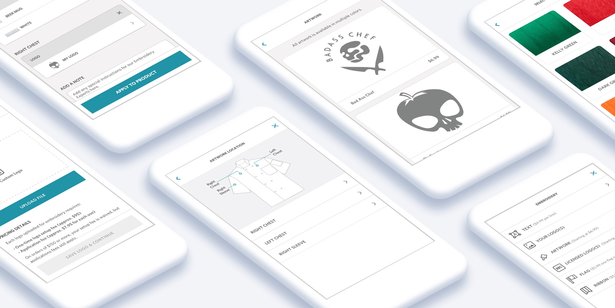
Mockups
Reviewing key screens in a more final visual form allowed us to preview the enhanced experience.
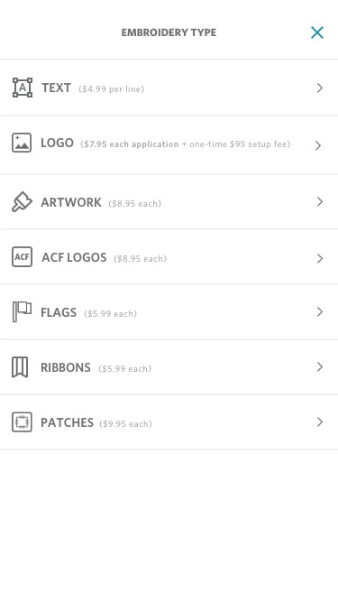
Main Menu
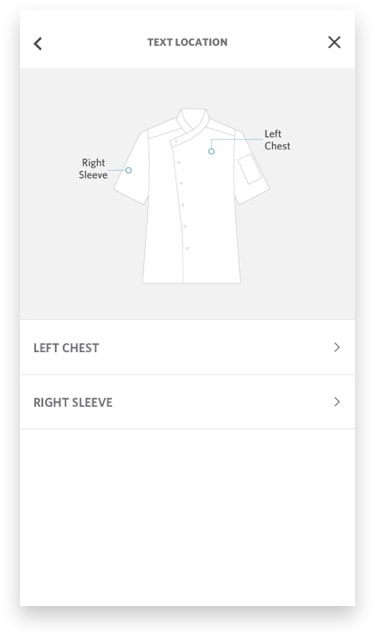
Location
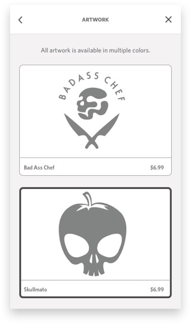
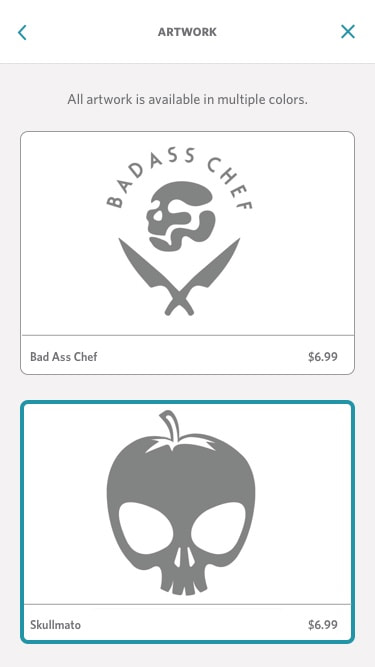
Artwork Selection
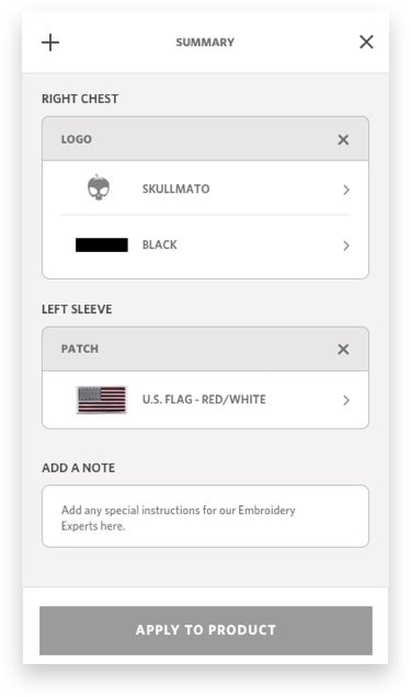
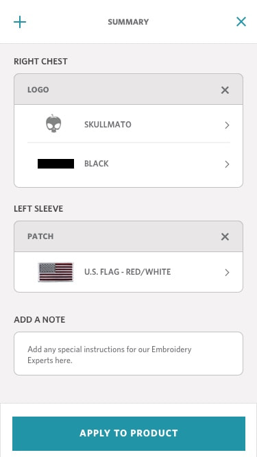
Summary
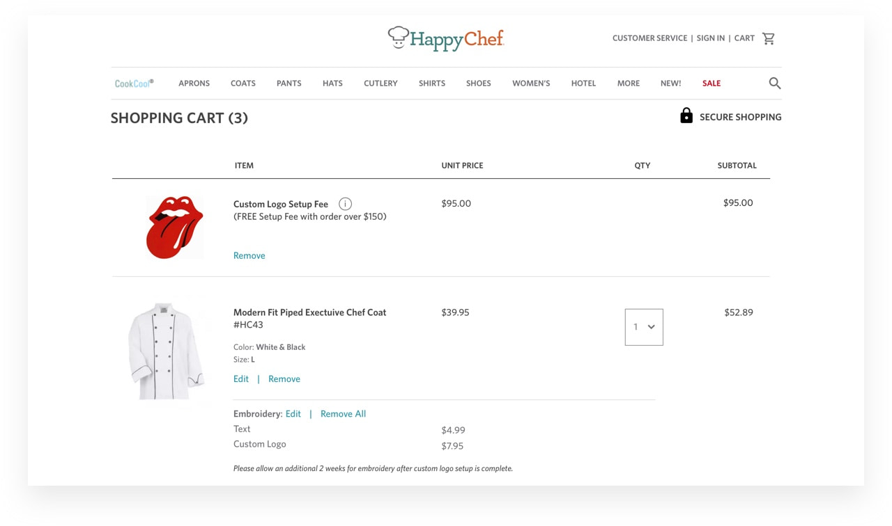
Completing the embroidery order
Completing the embroidery process from start to finish meant more than just selecting options. We needed to ensure that communications and pricing properly followed the user from the product details page to checkout.
Impact Summary
22%
Increase in embroidery conversion rates
30%
Increase in custom logo conversion rates
19%
Decrease in order abandonment rates